Most websites silently chase customers away. These 7 conversion-critical features are the difference between a digital brochure and a 24/7 sales machine.
1. A Value Proposition That Hits in Under 5 Words
You have exactly 3 seconds before a new visitor decides to stay or leave. Your hero section needs to answer three questions instantly: What do you do? Who do you help? Why should I care? Most business websites fail this test spectacularly with hero sections that say things like 'We provide innovative solutions' — which communicates precisely nothing. Compare that to 'Professional Websites for Brunei SMEs — Built to Convert.' Specific. Local. Benefit-driven. Pair that with one clear call-to-action button and you have a hero section that works. Vague headlines cost you clicks. Specificity earns them.
2. Social Proof That Actually Sounds Human
Generic five-star reviews do nothing. 'Great service! Highly recommend!' is the digital equivalent of a shrug. Social proof converts when it is specific: 'After CreativePressLab rebuilt our website, our enquiry rate tripled within 60 days — Danial, myHR System.' Name, company, measurable result. That is a trust signal. The most powerful placement is right next to your primary CTA, because that is precisely when potential customers are on the edge of deciding. Remove the uncertainty at the moment it matters most.
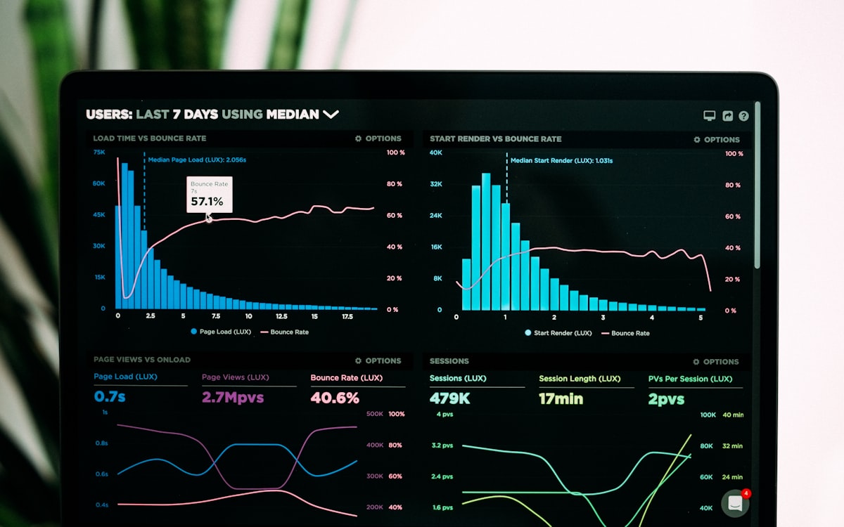
3. Page Speed That Respects Your Visitor's Time
Google's research is unambiguous: 53% of mobile users abandon a site that takes longer than 3 seconds to load. Every additional second of load time reduces conversions by 7%. For businesses in Brunei and Malaysia where mobile browsing dominates, a slow website is a silent revenue killer. The fix is not complicated but does require technical discipline: serve images in WebP format, implement lazy loading below the fold, minify JavaScript, and configure GZIP compression on your server. These optimisations are standard practice in professional web development — and frequently ignored in DIY builders.
4. Mobile Design That Was Built for Thumbs, Not Cursors
Over 72% of web traffic in Southeast Asia comes from smartphones. Yet the majority of SME websites in the region are still designed desktop-first with mobile as an afterthought — tiny tap targets, text that requires zooming, forms with microscopic input fields. True mobile-first design means your navigation opens with a thumb-friendly gesture, your CTA buttons are at least 48x48 pixels, your text is readable at arm's length without pinching, and your contact form works flawlessly on a phone keyboard. If navigating your website on a mobile device is frustrating in any way, you are losing the majority of your visitors before they ever reach your offer.
5. CTAs That Tell People Exactly What Happens Next
The difference between 'Submit' and 'Get My Free Quote' is not just wording — it is psychology. When a visitor clicks a CTA, they want to know what happens after. 'Get My Free Quote' sets an expectation: I will receive a personalised quote at no cost. There is no ambiguity, no risk, no confusion. Place your primary CTA in the hero, repeat it after your services section, and anchor it in your footer. Businesses that A/B test CTA language typically see 15-40% improvement in click-through rates just from this one change. It costs nothing to fix and can change everything.
6. WhatsApp Integration — The Southeast Asian Conversion Shortcut
In Brunei and Malaysia, WhatsApp is not just a messaging app — it is the default business communication channel. A floating WhatsApp button on your website removes every barrier between interest and conversation. Customers do not need to fill out a form and wait 24 hours for a reply. They tap, they message, they get an answer in minutes. Businesses that add WhatsApp contact to their website consistently report a significant uptick in enquiry quality — because people who message via WhatsApp are ready to talk business, not just browsing. This single feature integration can be the difference between a missed lead and a closed sale.
7. Navigation So Simple a First-Time Visitor Could Find Anything
Here is a test: give your website to someone who has never seen it and ask them to find your pricing and your contact form. Time them. If it takes more than 30 seconds, your navigation is costing you conversions. The rule for high-converting navigation is ruthless simplicity: five to seven items maximum in your primary menu, every label descriptive and literal (not clever), and your contact option always visible. Confused visitors do not ask for help — they leave. Every extra click you force a visitor to make reduces the probability of conversion by approximately 10%. Simplify relentlessly.